


Whether it is a flat-screen telly or a gas guzzling Ferrari with just two seats, everyone knows the scenario. You see it, you love it, but is it really practical? And that is without even considering the price tag.
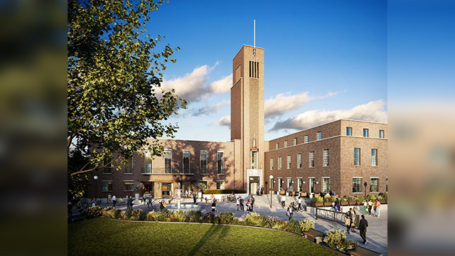
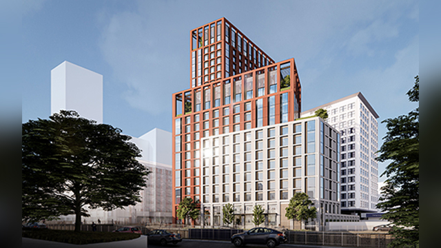
So maybe it is understandable that managing directors seem to be going through the same procedure when looking for an office. The UK’s cities are blooming with unconventional landmark buildings. And it is not just galleries and public spaces that are getting the celebrity architect treatment. Whether it is London’s proposed Shard of Glass, or the Birmingham Bullring’s Selfridges store, the square, filing-cabinet shaped office block is being filed away.
No doubt a landmark building raises a company’s profile. But while landmark buildings win awards, how practical are they for occupiers who have to work in them? Once the chairman has given his speech, and the press have stopped calling, do the ordinary workers slip easily into their new space or are they left feeling more than a little out of place?
Landmark buildings
The news that Liverpool has scrapped plans to build Will Alsop’s infamous Fourth Grace epitomises the problems of developing a landmark building. Announcing the decision in July, Sir David Henshaw, chief executive of Liverpool council, said the scheme’s backers were determined to ensure the it did not become a Millennium Dome mark 2. He added that the project was too expensive, having risen some 40% to £342m since the original concept was presented, and had departed significantly from the original with a huge increase in its residential element.
Alsop is unfazed by the decision. On the day after, he unveiled plans for a sugar cube office block in Middlesbrough. But developers and investors should heed the warnings from history.
The Ark in Hammersmith, west London, was supposed to be the office of the future. But despite being widely regarded as an exceptional building, it struggles to find one occupier large enough to take on its theatrical proportions, or several willing to share its communal atmosphere.Designed by UK architect Erskine in the late 1980s, it is a 250ft high imposing steel and glass structure with all floors opening out into a massive atrium. Having worked extensively inside the Ark, Phil Hutchinson, joint managing director of BDG Workfutures, says: “It’s like a theatre in there, and the challenge is the scale.”One solution would be to split up the 142,000sq ft property, but even this is problematic. “It would be interesting,” says Hutchinson diplomatically, “the common areas make up so much space.”
He explains that it is easy for occupiers to get carried away by landmark buildings. “It is quite easy to be seduced by a building and buy into the architectural style,” he says. “After the initial ‘wow’ factor often comes the realisation of the restrictions of the space and the responsibility of occupying such a high-profile building.”
Made to measure
Hutchinson adds that, while designers are thrilled to be commissioned for an unusual building, “often we can arrive at a building and find the end user doesn’t always understand why they are in the building, apart from the fact that it is the best and it is landmark.”Even if a building is made to measure, what happens when that space becomes surplus to requirements for an occupier? Subletting can be an issue, explains Richard Kauntze, chief executive at the BCO. “It’s like trying to sell a house,” he says. “You might love red paint, but not everyone will. You want no clutter and cream walls. It’s the plain vanilla argument.”
The more unusual the building, the more unusual the space configuration, and the more likely it is to restrict occupier’s needs. “If you build a building and can only let it to one narrow tenant, and no one bites, then you are in trouble,” says Kauntze.
He is not against landmark buildings. Taking Swiss Re as an example, he says: “I cannot think of a building that has become so iconic so quickly. It is a wonderful building to look at in terms of its aesthetic contribution to the skyline and the build quality.”
He also cites the BA building at Waterside — a BCO-award winner that pioneered the concept of putting a high street into a big building. It also gave BA the design statement it craved.
“The distinction between wacky and conventional maybe boring,” Kauntze adds, “but on the open market, the former might not be to everyone’s taste.” But he cautions: “What a big building also does is restrict options. If it no longer suits the occupiers, then it is the very opposite of plain vanilla.”
Swiss Re will soon find out if this is the case. Agent for the tower, DTZ, says the building has generated an incredible amount of interest. The problem, says DTZ director John Forrester, is that there is very little demand in the City.
“If you look at any successful multilet building, it takes a long time to do the 10-15 deals required to fill a tower building,” he adds.
While the Swiss Re tower might look like an unconventional building, its fit-out has achieved the design equivalent of putting a square peg into a round hole.
A cross-section of the building shows a six-fingered asterix with each arm representing a rectangular office space. Richard Beastall at TP Bennett, designer for the tower, says the triangular cutouts act as light wells which, in Swiss Re’s case, have been turned into meeting spaces and break out areas.”As long as there is very good regular space, the odd areas that create the beautiful architecture are the only challenges,” he adds. By designing from the core outwards, even the floorplates, which get narrower toward the top of the tower, were not problems, says Beastall.
Developer
Akeler took this one step further, adopting an inside-out approach to design. Flexibility is key to occupiers, explains chief executive Trevor Silver. He says a lot of businesses change as they grow or shrink, and they have furniture modules that need to be incorporated into a design. As a result, says Silver, “we don’t set out to build landmark buildings”, restricting design features to entrances and front facades.
“I think you have to be careful with phrases such as iconic or wacky,” says Silver. “Wacky suggests gimmicky, and if you are not careful you can turn off potential occupiers.”
One of Akeler’s most unusual schemes was Doxford International Business Park near Sunderland, where it developed a building with a solar panel facade. “A stipulation was that the buildings on the park needed air-conditioning, so we wondered if we could design one that didn’t,” explains Silver. “But there was a pay off. It was the hardest to let. It was slightly ahead of its time,” he says. “Northern Rock is now in there, and I believe they love it.”
Simon Knights, divisional director at Strutt and Parker, believes that part of the problem of letting unusual buildings is agents’ attitudes. “It’s not just a chunk of space,” he says. “You have to sell the attitude and make it more than the building blocks, otherwise you might as well just flog an elongated filing cabinet building.
Technology is leading architecture, it is like architectural theatre. Someone comes up with a new way to bend steel so architects think ‘let’s do something with it’.”
So has architecture become wacky for wacky’s sake? Ed Clarke at Arup, engineer of Selfridges’ Birmingham store, believes some designs could be a fad. “There will be a place for these buildings where appropriate, but we have to be careful it is not just gratuitous wilful explosion of geometry,” he says.Corporate attitudes to unconventional buildings are changing, which can only be a good thing, explains Clarke. “Look at the Guggenheim in Bilbao and similar buildings. These are bespoke, unusual spaces at the high end of the budget. But now these are moving into retail and offices, which are hard-nosed businesses.”
The issues in building the Selfridges store were not so dissimilar to those of office occupiers. Clarke explains that Selfridges wanted a flexible space to accommodate an ever-changing display of concessions, and an exciting, interesting architectural statement that could be built for the same price as a conventional building.
Universally praised
It certainly got its statement, but it also got a store based on an inner racetrack-style circuit that is almost universally praised. Clarke admits that the shape of the building is not as efficient as a square. “Selfridges still needed service areas and escape routes, but we’ve had to work around those and create a clever use of space. It meant throwing away the usual grid.”
As with office occupiers arriving with their own furniture modules, some concessions arrived with the “same old block”, which had to be placed along a straight edge. “But others viewed it as an interesting challenge to design something new,” says Clarke.