


Colour blindness
Colour-blindness is, in most cases, a genetic condition, usually inherited from the mother. It is believed that faulty colour-discriminating “cones” in the retina are at the root of the problem. There is no cure.
Trichromacy effectively means “normal” colour vision. Trichomats use all three types of light cones correctly.
Anomalous trichomacy occurs when one cone in the retina is slightly out of alignment. This causes either: protanomaly, a reduced sensitivity to red; deuteranomaly, a reduced sensitivity to green; or tritanomaly, a reduced sensitivity to blue.
Monochromacy means that no colour can be seen – just shades of black, white and grey. Blue blindness and monochromacy are very rare, but red-green colour blindness is quite common.
Sufferers generally have difficulty distinguishing between red, green, brown, orange, yellow and grey, which appear as varying shades of murky green.
Feeling Blue
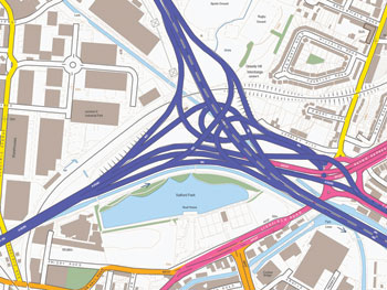
For people with a certain type of colour-blindness, the Ordnance Survey’s Pink Land Ranger map, on the left, appears blue. Simon Duquenoy, senior product technical manager with the OS, says: “The most common colour-blindness is an inability to tell the difference between reds and greens, which appear as shades of grey or brown, making it difficult to interpret the colour-coded features shown on maps.”
But OS has developed a new product to help make mapping easier for the colour-blind. “Digital mapping – called OS VectorMap Local – is customisable, allowing for the creation of colour blind-friendly styles,” says Duquenoy.
“Councils and businesses will be able to create styles especially for colour-blind people. We hope this will make life easier for them.”
Kathryn Albany-Ward, of Colour Blindness Awareness, says: “This demonstrates the amount of colour lost when you are colour blind and shows that retailers, especially supermarkets, might be missing a trick when it comes to stocking up and product placement.”
Say what you see
Facebook’s little fat white “F” on a blue background is probably one of the world’s most recognisable logos. Less well known, perhaps, is the fact that the colour scheme was chosen because Facebook founder Mark Zuckerberg is red-green colour-blind.
But Zuckerberg is far from alone. Colour-blindness is a genetic condition that affects around one in 12 men and one in 200 women, to varying degrees – the gene is normally passed on by mothers to their sons – and it can have a significant effect on their everyday lives.
Think about the London Tube map, electrical wiring or traffic lights; all of these, which most people take for granted, can pose problems.
The same is true for colour-blind people in the property sector, who face a myriad of difficulties. They may struggle to read building and estate signage, or press advertisements containing information – such as a greenfield site edged in red – that is virtually inaccessible to them.
Then there are problems with websites featuring large amounts of difficult-to-see information.
Presentations, research documents, shareholder information and reports usually include graphs and charts that for the colour-blind can be impossible to follow. Ordnance Survey and Land Registry documents are the obvious examples that cause headaches.
“Historically, paper mapping colours gave people with colour deficiency a problem,” says Simon Duquenoy, senior product technical manager with the Ordnance Survey.
They would struggle, he explains, to distinguish the greens used for grassland and trees, the reds denoting main roads and public footpaths, and the blues used for motorways and rivers.
To combat this problem, for the past 18 months Duquenoy and his team have been looking at using new software and different shades and hues (see panel below).
However, Kathryn Albany-Ward, a qualified chartered surveyor and founder of Colour Blind Awareness, believes that more needs to be done in the property sector.
Albany-Ward set up her organisation two years ago to raise awareness of the needs of colour-blind people in the community after her seven-year-old son was diagnosed with a severe form of deuteranopia (see panel above, left). She says that the industry should be considering three important questions.
Why waste your budget?
First, accessibility. “Wouldn’t all companies want to ensure their intended audience can access all of the information they want to convey?” she asks.
“For instance, what is the point of wasting up to 8% of your marketing budget? Why would you want to put together a presentation that up to 8% of your audience cannot access either through advertising or marketing brochures?”
Second, discrimination. “Are companies ready for the consequences of continuing to discriminate against colour-blind members of the public using their facilities – such as shopping centres – when they cannot fully access information?” asks Albany-Ward.
She highlights shopping centre directory boards, car park/building circulation information, and website directions as problem areas because their design reflects poor colour choice.
“The law has not yet been properly tested, but employment tribunal case law is growing,” she adds. “It only takes one case in court [to set precedence].”
Third, legal protection. Albany-Ward asks whether employers “have procedures/policies in place to ensure that their colour-blind staff [40% of colour-blind people are not aware of their condition when they leave school] are protected against discrimination if they unwittingly make a mistake (with, for example, title plans) because of colour issues”.
She stresses: “The company would have to make sure it is protected against the unwitting mistakes of their colour-blind staff.”
While emphasising that she does not want to preach to the industry, Albany-Ward says that these issues could affect every company.
Some firms are already taking action. For instance, Savills has ensured that both its website and in-house material/research documents are suitable for colour-blind people.
Mat Oakley, director of commercial research at Savills, is red-green colour-blind. His condition, he says, has made him more aware of the importance of trying to use colours that are not too similar.
Quite simply, he states: “If I can’t tell the difference, then others can’t either.”
Heightened awareness
It is this heightened awareness that Albany-Ward hopes will make not only the property sector, but all sectors of working life, better for people with colour-blindness.
Look out for next week’s Estates Gazette and EGi as BCSC chief executive Michael Green shares his experience of living and working with colour blindness.